User testing
Spending time watching users test a product is a hugely rewarding process. There are always things to learn and what is obvious to you is often less obvious to your target users. So we took the opportunity to do some one-to-one user testing over Zoom, sharing screens and recording the session to refer back.
We focussed on the content editor and site manager administrative tasks of creating content, managing taxonomies, managing users, and customising the site.
Summary of findings
After testing with 4 people, we had a general sense that the system was overall very intuitive to use (woop!) but we did collect a number of issues that suggested room for improvement.
- In general, everyone commented on how intuitive it was to manage content.
- Users did not know where to log in, suggesting a link to log in might help.
- Not clear what the new page and landing page content types were for, they were lacking descriptions.
- Not completely sure what "Taxonomy" means.
- Uploading a logo with a white background looked bad on a grey header, suggesting the ability to recolour the header would be welcome.
- The label "Link block" did not immediately make sense on the landing page content type.
- Not sure of the purpose of the different input format options under a formatted text fields.
- When adding a new user, what is the 'URL alias' for?
- When inserting a table, the formatting is not clear in the text editor.
- Would really like a featured image on a resource.
- Would like to be able to add a PowerPoint (ppt) page.
- Would like to be able to add a taxonomy term directly from the resource creation form.
- Not clear where to go to manage the resource hub customisation options.
- Can external links be set to open in a new tab by default?
- Could we have the option to alter the size of the logo?
- Would love the form to auto-save when adding content.
Other comments included:
"Fairly straight forward, easy to play around with. "
“Pretty straightforward, quite intuitive”
“I think it's really intuitive”
One person even said "This is so much more user friendly than Wordpress", which is a good sign!
Rapid response
Within days of gathering this input, we (well, Maria, mostly) had implemented changes to address a significant proportion of the issues that were raised.
Many quick improvements to the user form were made with the Simplify module and customisation of the form display modes.
A good example of this is the taxonomy term edit form.
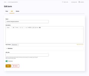
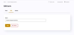
Presenting just the fields a user needs is an obvious improvement to their experience, but one that we sometimes forget as regular users of a content management system.
The same principle of simplification is happening in a number of other places in the coming sprint.