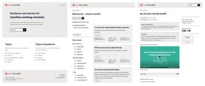
A roller coaster of a week, including charity stakeholder interviews, collaborative wireframing and prototyping, culminating in 7 user testing sessions on Thursday to test an early prototype and gather valuable feedback.
Stakeholder cohort
The week started with some uncertainty around how many charity stakeholders we could include in the project. We were originally aiming for 5, but slow responses from some led us to reach out to more and in the end 7 charities had accepted our offer to be involved and we really didn’t want to miss anyone out. Luckily Gilly at Cast confirmed that all 7 could join the stakeholder cohort and still receive funding for their time, so this allowed us to proceed to interview all 7 charities and include them all in testing our early prototypes by the end of the week.
Most of Monday was taken up with confirming our assumptions on the MVP (minimum viable product) functionality for the product as a whole and for each piece of critical functionality.
From this we created storyboards for a number of key interactions, such as search > filter > find a resource > share a resource.
Collaborative prototyping
Wednesday was an intensive rapid prototype session, working collaboratively in Figma to build out wireframe screens to test with our stakeholder cohort. This was a lot of fun! Richard prepared the board with a number of screens based on the storyboards we had defined. With each of us taking different screens, we were able to develop a number of ideas in parallel before reviewing and iterating until we had enough pages to link together and form our clickable prototype.

Testing with stakeholders
Inviting each of our charity stakeholders to a separate half hour Zoom call allowed us to run through the same script with each, taking notes as we went and recording the session to be able to review later. We asked each user to imagine they were a professional therapist looking for guidance on how to run remote meetings over video conferencing, and guided them through the landing page, searching for some content, filtering the content and reviewing the different options for the resource / guidance content.
Feedback
The feedback was generally positive, confirming that we’re on the right track with most of our assumptions, but also highlighting a number of things that we’d not considered.
To the left, to the right…
Testing primarily at desktop resolutions the filters for the search results were initially displayed in a right hand sidebar. We noticed that most of the test subjects did not notice the filters until we guided their focus over to the right hand column. For the last two tests, we switched these over a left hand column and out testers did notice the filters immediately.
This would clearly benefit from more extensive testing to build more evidence, but it was an interesting example of an assumption that was tested and challenged leading to changes in our initial design.
Specific types of content vs long-form content
Our test scenario involved searching for guidance on managing remote meetings, filtering by video and clicking through to a piece of ‘guidance content’. The first piece of content the test users see is a long-form web page which includes text, image, video, file attachments and related content. The fact that the video was about half way down the page caused some confusion, as the user had filtered by ‘video’ to get here, so was perhaps expecting to see just a video. This is understandable and may have been due to some misunderstanding between the team on how we’re planning to categorise content. This also highlights the question of whether to have a single content type that could have multiple content components including text, images, videos, PDFs or to create specific content types for a video resource, a PDF resource and a web page content resource. We are leaning heavily towards the flexibility of the former as it would be odd to restrict the ability to embed videos and attach PDFs to a web page resource, making the specific content types potentially redundant. One thing to consider here is that this will put more reliance on the content manager to categorise the content appropriately. In our test case, this might mean that the resource item would be categorised as PDF, Video and Web page content. This might be something that we want to test more specifically as we build out the product and could be easily changed. Ensuring the right balance of flexibility and ease of use is perhaps the main challenge here.
Playback and start building
We learnt many other things which will feed back into the build process and are looking forward to sharing our findings so far with the wider cohort at a playback session on Monday befoer we start the build sprints on Wednesday.
