Drupal 8 has taken a big leap forward with responsive images; and, with the addition of manual cropping tools, you can now easily give great flexibility to your users without compromising on design integrity or overcomplicating things. Let's take a look at how this works.
The Breakpoints module
The breakpoints module is now included in Drupal 8 core, which is a great step forward in enabling Drupal 8 to be responsive out of the box.
First of all we need to ensure we have breakpoints defined in our theme - in the yourtheme.breakpoints.yml you can define them like this
yourtheme.mobile: label: mobile mediaQuery: '(min-width: 0px)' weight: 0 multipliers: - 1x
yourtheme.narrow: label: narrow mediaQuery: 'all and (min-width: 560px) and (max-width: 860px)' weight: 1 multipliers: - 1x
yourtheme.wide: label: wide mediaQuery: 'all and (min-width: 861px)' weight: 2 multipliers: - 1x
How to set up responsive images in Drupal 8
As with the breakpoints module, the responsive images module ships with Drupal 8 so you simply need to enable it by running the following drush command:
$ drush en responsive_image
The following extensions will be enabled: responsive_image
Do you really want to continue? (y/n): y
responsive_image was enabled successfully.
You can configure the responsive image styles through the UI at /admin/config/media/responsive-image-style
Create a new responsive image style.
Choose your theme from the breakpoint group (you can define multiple breakpoint groups in your theme by adding .groupname to the name of the breakpoint and group: yourtheme:groupname declaration. Eg
yourtheme.groupname.wide: label: wide mediaQuery: 'all and (min-width: 861px)' weight: 2 multipliers: - 1x group: yourtheme.groupnameYou then have the option to use multiple image styles and use the sizes attribute, see the Responsive Image help page for more information about the sizes attribute.
You can also select a single image style per breakpoint, or not use a particular breakpoint.
Image styles themselves are configured in a similar fashion to Drupal 7 - /admin/config/media/image-styles
Once you have this set up Responsive Image becomes available as a field formatter on any Image field.

How to crop images in Drupal 8
You will need to download the following modules:
- ImageWidgetCrop
- Requires: Crop API
- Cropper Library
These are the installation steps taken from the module README:
Installation ------------
1. Download and extract the module to your (`sites/all/modules/contrib`) folder.
2. Enable the module on the Drupal Modules page (`admin/modules`) or using $ drush en The module is currently using Cropper as a library to display, the cropping widget.
To properly configure it, do the following: * Local library:
1. Download the latest version of Cropper at https://github.com/fengyuanchen/cropper.
2. Copy the dist folder into: - /libraries/cropper or - /sites/default/libraries/cropper or - /sites/EXAMPLE/libraries/cropper or - /sites/all/libraries/cropper
3. Enable the libraries module. * External library: 1. Set the external URL for the minified version of the library and CSS file, in Image Crop Widget settings (`/admin/config/media/crop-widget`), found at https://cdnjs.com/libraries/cropper. NOTE: The external library is set by default when you enable the module.
How to configure a cropping types
Once you have installed the module you need to add a crop type so go to /admin/structure/crop/add
This allows you to define an aspect ratio (or not), a soft limit and hard limit. The soft limit warns the user when they are trying to crop an image smaller than the limit, the hard limit will not allow them to crop smaller.
You can then choose ImageWidgetCrop as the widget for an Image field on the Manage Form Display on any given content type.
This allows a number of options, and you can choose one or more crop types for this field.
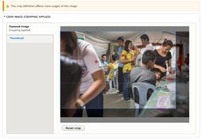
The user is then presented with an easy to use cropping interface, which helpfully warns you if you're cropping an image with multiple uses.

ou'll still need to set/create an image style/s to use the crop type - which you can then set as the field formatter in the display section for your field, or assign to an responsive image style if you want responsive cropped images.
Sliders in Drupal 8
My first forays into sliders show that both the following are available:
- Jssor slider
- Flexslider (currently still in dev)
Both work, but my preference is flexslider as it's more configurable and nicer to theme - and more familar.
A few notes:
Flexslider Fields needs to be enabled to use it as a field formatter.
The D8 version of the module allows intergration with views without a separate module.
Tie this all together and we can have croppable, responsive sliders - what more do we need!
