User testing of the early prototype is complete! In this sprint, we aimed to test the architecture and user experience of creating new microsites, assigning users, configuring the look and feel, and adding content to a page. With 14 users across 5 councils lined up, we invited Kayo from Telltale Research as well as our own Steph and Rae to help.
Interviewing
Day 1 of testing (26th May) was our most intense, with back-to-back sessions scheduled with 5 users from Croydon, BathNES, Wirral, and Blackburn councils. The rest of the sessions were spread across the following week, with more users from Waltham Forest, BathNES, and Blackburn. Each test was assigned to two people on the testing team to cover the bases of facilitator and note-taker, and once we were armed with our script, plan and pre-prepped Miro board, we got the ball rolling!
Users were invited to test the early prototype for the first time and work through the various stages of creating and editing a microsite. Through their interaction, we were able to gain insight into their mental models, observations, positive interactions and pain points. These insights highlighted successful points of the early prototype as well as areas for improvement and bug fixes.
The microsite was reset between every session so that each user followed the same process. Initially, we had 14 user sessions lined up to test the early prototype, however after gathering a plethora of insightful information and identifying patterns in user experiences, we felt that it would be best to postpone the final 4 users to a later stage. Overall, we met with 10 users and found that we were able to identify the most common user journey quite early on.
Affinity mapping
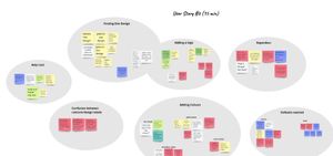
After completing half of our scheduled user sessions by the end of Day 1, our Miro board was already overflowing with overlaps in user journeys, suggestions from users to improve the user experience and so much more. Our Design Apprentice, Rae, began an interim analysis and started to collate notes that followed similar patterns into groups, a process called “Affinity Mapping”. Through this, we were able to pull initial key insights quite quickly.
At the end of the testing run, the team reflected on our findings together. Steph and Rae spent some time affinity mapping the final user tests and sorting through the Miro board. By doing this collaboratively, we were able to pull out key insights on user behaviours and pain points, as well as note down the positive feedback. The interim analysis proved to be incredibly useful in clarifying the overall user experience.

See the Miro board for more details.
Summarising the findings
Using the research analysis, we drafted a report alongside Kayo from Telltale Research, which provided an executive summary of the user testing with an outline of the methodology. The report also covers thematic findings and specific test results of each user story that were uncovered during the testing period. Using the findings from the user testing we were able to collate a series of recommendations that will improve the user experience of the prototype. A few examples of recommendations are to:
- Update the labelling, signposting and help text to cater to all levels of ability/experience
- Create demo sites that show “sophisticated” designs created through the UI
- Allow users to ‘preview’ before ‘publishing’
- Relabel ‘Add media’ as ‘Add image’

