We know that accessibility is important, but it can be hard to know where to start. We want to produce content that reaches the right people, but we don’t know what we’re doing to stop that happening. We want to understand, but the pure volume of guidelines are overwhelming.
The following is part of a series of posts written for people who write content on the web better understand what they can do.
Understanding how different people access the web (and the world)
As an introduction, I highly recommend reading the user profiles generated by Government Digital Services (GDS). The staff at GDS have created individual personas with wants and needs, and described their experience of accessing the web and the barriers their conditions produce. To take this even further you can simulate some of those conditions in your own browser.
Understanding the barriers people experience helps us understand how we can - at the very least - not make things more difficult for them. Doing so is not difficult, but it does require us to analyse our decisions from a variety of perspectives: How would I experience this situation if I could only hear that content? how would it be if I was both hearing and seeing this piece of content? How would I manage this interaction if I had less motor control than usual?
Because it is hard to keep all these perspectives in mind when we’re just trying to get on with our jobs, some organisations decide to introduce either a formal workflow so that content can be checked over by a trained editor before it gets published. If that is not possible you may want to keep a checklist near to hand which you can run through yourself before you hit the “publish” button.
Writing accessible web content is an art and can feel daunting. Hopefully the following guidelines will give you some ideas of how you can improve your content.
Readability
Perhaps most fundamentally, content should be understandable by the people who are trying to read it. Keep in mind that some people reading your content may have a permanent disability or learning difficulty which makes it harder to comprehend the words on the page, some people may be suffering a temporary difficulty such as distress or tiredness, and many may not speak English as their first language.
There are 6 WCAG (Web Content Accessibility Guidelines) criteria directly related to the readability of the content we provide. While a couple refer to the ability to determine the human language of the page and left to your developers, the others encourage us to make the content we write clear and comprehensible.
Key Points
- Write in clear, well-structured sentences. Review how readable your content is with an online tool - WebFX provides a good tool.
- Always write at the appropriate level for your audience, and if you don’t know what that is - the a11y project suggests that you aim for the reading level of a 12-16 year old.
- Avoid, or explain, the use of jargon and acronyms. If you have access to them, consider using the definition (DFN) or abbreviation (ABBR) HTML tags to explain unusual words or phrases. These tags will provide additional information about the word or abbreviation you are using.
Headings and Page Titles
The title of your page should be a clear indicator of the content of the page.
Not only does that help with SEO, but it announces to a user who doesn’t have the same opportunity to scan the contents of the page whether this page has the content that they are looking for.
By default the Page title is wrapped in an <h1> tag, which indicates that it is the most important piece of information on the page.
Headings
In HTML we have 6 levels of headings <h1> to <h6> . Heading level 1 <h1> is considered the most important, and often used to indicate the page title.
Usually, when we are just adding content to our sites, we don't have much control over the HTML our websites create but we do often have access to paragraph formatting. In the text editor I'm using right now, I have a drop down menu which allows me to make a piece of text a normal paragraph, or number of different headings. Heading 1 wraps the text in an H1, Heading 2 an H2 and so on.
When properly used headings can help your users quickly scan your content to gauge whether or not it's useful, or to find the useful piece of content on a page. For sighted users this hierarchy is usually indicated visually by different sizing and styling of the text, and gives us an overview of what is covered in the text.
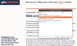
Most screen readers will announce the Headings on the page when they arrive on the page, to give the user an overview of the content. Users of a screen reader can summon a list of those Headings and navigate directly to the section we are interested in. It's important, therefore, to make sure the Headings give enough meaning to be useful when taken out of context.
Use (at least) one H1 per page
There are different opinions about whether there should be more than one H1 on the page, now that Google has announced that it will not penalise people who do use more than one. A survey carried out by WebAim showed, however, that users of assistive technologies much preferred one H1 per page, which included the page title
It is clear is that there should be at least one H1 on every page in order to announce to the world (search engines included) what this page is about. In most circumstances the Page Title should be the H1.
There are a few instances - homepages for example - where the designer has decided to hide the H1 for aesthetic purposes. There are various ways to deal with this, but the best is to keep the H1 in the HTML but to visually hide it in a way that assistive technologies will still be able to read it.
Do not skip Heading levels
To accurately reflect the relationships between each section of content, headings should be nested, and shouldn’t skip levels. An H1 should not be followed by an H3.
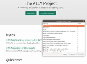
For example, the A11Y Project’s homepage has 43 headings, all nested appropriately
- H1: The A11Y Project
- H2: Categories
- H2: Myths
- H3: Myth: People who use screen readers don’t use Javascript
- H3: Accessibility is ‘blind people
- H2: Quick Tests
- H3: Quick Test: Resize text
- etc etc
Headings shouldn’t be used for stylistic purposes either. You should pick the appropriate heading, not the one you think looks the best. Talk to your friendly web development agency if you'd like to change the styling of your headings.
Equally, don't use bold text in the place of a heading. A person navigating by screen reader won’t have access to a “heading” that you’ve styled by just increasing the font size and making bold.
Providing Emphasis
Text formatting can help with legibility and comprehension of text if they are used correctly.
It is important not to use text formats though. Avoid making large pieces of texts italisied; studies show that blocks of italic text decreases reading performance for people with dyslexia. On the other hand, highlighting one or two important words can help with legibility.
There is a technical difference between the various HTML tags we can use for emphasis.
Bold <b> and italic <i> tags are generally not announced by screen readers, so their importance will not be communicated to readers who are only using a screen reader. There are occasions where this might be your intention, but usually we want to give the same information to all of our users.
The emphasis <em> and strong emphasis <strong> tags can be announced by a screen reader, and are usually appear the same as their counterparts (italic and bold respectively). Generally it makes sense to use the <em> and <strong> tags.
If you don't know which your site outputs, please ask us to check it for you.
WRITING IN UPPERCASE
Text written in all uppercase appears quite SHOUTY, and it is also harder to read.
To add to this, it can result in unexpected pronunciation by screen readers – for example CONTACT US is often pronounced ‘Contact U.S.’ by a screen reader.
Links
Links are the backbone of the internet, but poorly labelled links are unhelpful and disorientating.
‘Read more’ and ‘click here’ are particularly unhelpful for users of assistive technologies who might come across these links out of context.
For example you can access a list of links on a webpage, and navigate to them. A blind or partially sighted user might use the keyboard to skip through the page link by link - just hearing the link text.
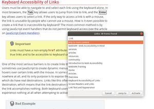
What is useful is if the link text describes where the link is going, so the user knows what is going to happen when they click the link.
Screen readers usually announce that a link is a link, so it's unnecessary to use the words “Link to ...”
Put the distinguishable information at the beginning of the link title. If there are multiple links which begin in the same way users will find it more difficult to distinguish between them.
Equally, long complex URLs are often meaningless to users. If you need to write out a full URL try to keep it short, generate a nice alias if you can, or generate a short readable URL using one of the many online services.
Summary:
-
Links should always have some text associated to them, so if you are making an image a link, ensure the image has useful alt text.
-
Link text should be descriptive
-
Links should make sense out of context and out of sequential order.
Ok, that’s it for now, but we’ll be posting more in the next few weeks. Let us know if you want us to tackle anything specifically and we’ll see what we can do!