
Lady Margaret Hall website
We have a longstanding partnership with Oxford University College, Lady Margaret Hall (LMH). Most recently, we worked with them on a site refresh to better represent the spirit of their community and to improve the user experience. The project involved a comprehensive discovery phase, design sprint, and reskin of LMH's existing website.
We took a two-designer approach, with Steph and Rae working on the project. This approach proved highly effective in dividing tasks and streamlining the design process. Maria was the lead developer. Read on to discover how we helped them to improve the site's UX, performance and accessibility.
Project Overview and Scope
LMH came to us because they felt it was time to update and improve their site and brand identity. They had also identified several site issues, including usability for site editors and restrictive page layouts. However, they also wanted our help to gain a deeper insight into how they could improve the UX for all their users.
Therefore, we undertook an initial discovery phase in early 2024, which included:
- A usability audit
- User consultations (interviews with students and site editor)
- An accessibility audit
- An analytics review
Based on the findings, we produced a comprehensive report for LMH with recommendations and a roadmap, which included:
- Recommendations to run a design phase focused on creating a new brand identity.
- A reskin of the site using existing paragraph types to avoid a complete site rebuild.
The main areas we wanted to focus on were:
- Change the look and feel of the site
- Improve the accessibility
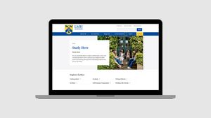
- Redesign the homepage to align with user journeys
- Improve page layouts, which were limiting and outdated
- Change brand colours were not well represented on the site
The roadmap helped the client develop a clear plan for the limited resources available, taking a phased approach to the work.
We didn’t compromise on the outcomes; instead, we divided the work into manageable segments that could be completed over a longer period of time. This process was a great way to achieve impactful change without completely rebuilding their site and shows how iterative improvements can be a viable solution if you are dealing with significant resource and budget constraints.
Design Process and Collaboration
Steph was the lead designer, with Rae as a support.
The design process commenced with a mood board activity to establish the design direction. Then, multiple feedback rounds were held with various stakeholders, including the college principal, Professor Stephen Blyth. Agreeing on a design direction at this early stage was a useful way to get our designers to move quickly, building out all components and page layouts without getting distracted by the smaller visual design details that would later be added in.
Content Strategy
The design phase was undertaken in close collaboration with Katie (LMH product owner) while she conducted an extensive internal content audit. The designer team provided "ideal version" mockups to guide content improvements, and Katie focused on retiring, synthesizing, and optimizing existing content.
Key Challenges and Solutions
There were 3 key challenges the team faced on this project.
Applying print-focused brand identity to digital environment
Solutions: We took the brand guidelines and translated them into three mood boards, and alongside the clients, we decided on which route was best to follow.
Improving People and Courses sections.
Solutions: We transformed long, scrollable lists into filterable directories and added advanced search functionality and subject/role filters. This was completed in phase 2.
The goal was a reskin, so the site's content would remain unchanged. Therefore, prototypes had to align with the existing content.
Solution: We created an 2 mockups for each page: a realistic mockup based on existing content, and an ideal mockup based on new content or different paragraph types. The prototype allowed the client to see what was possible within the project's scope and also manage expectations of what was possible without content changes. Conversely, it showed the potential of the current site functionality with some content changes.
Outcomes
Improved the UX for content editors
Maria made some small changes to the paragraph fields using the latest version of Drupal, making the edit view much easier to use. We also switched to the new media browser, which allowed image manipulation from the edit view.
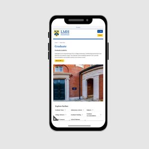
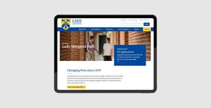
Created a new theme and successfully reskining the existing site structure
By starting the theme from scratch we didn’t have to deal with any legacy issues. We used our own custom built base theme, which gives us enough tools to get started very quickly without any superfluous code, such as Javacript. This helps to cut build time and improve site performance. Using the existing site structure saved time and money without, for example, the need for content migrations.
The new theme better represents the brand and lends it greater credibility in the university space with a more engaging look and feel.
Improved Site Performance
Based on the performance audit we made a number of changes in the new theme, for example we started to use webp images by default.
Improved accessibility
The audit uncovered many accessibility issues. Two of the most useful changes were:
- Link text changes to have unique link text for easier navigation using screen readers.
- New navigation that is slimmer, more standardised and keyboard accessible.