UNICEF / WHO Joint Monitoring Programme
The Joint Monitoring Programme (JMP), managed by UNICEF and WHO, is the global guardian of water, sanitation and hygiene data (WASH) and has reported country, regional and global estimates of progress on drinking water, sanitation and hygiene (WASH) since 1990. JMP maintains an extensive global database and has become the leading source of comparable estimates of progress at national, regional and global levels.
Making the data accessible and maximising its usefulness in decision making and awareness raising is central to JMP’s purpose. The changeover from the Millennium Development Goals (MDGs) to the Sustainable Development Goals (SDGs) in 2016 required the JMP to rebuild and reorganise their existing website and strategy for data sharing.
Discovery
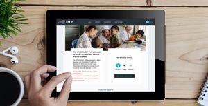
JMP’s legacy website had become increasingly difficult to search and navigate, and understanding what the website was offering and how to access the information had become unclear. Adding new content was complicated for editors and uploading and managing data was difficult and prone to errors. The site wasn’t meeting required accessibility and security standards and had not been designed with mobile and other devices in mind.
By analysing site usage statistics we identified where the legacy website had been underperforming and ran user research interviews to identify the highest value content, data stories and user journeys. Uncovering the needs of the site’s external audiences meant that we could help JMP make their dataset as effective, engaging and accessible as possible.
We put a project team together with the skills to produce complex data visualisations as well as to securely host, rebuild, re-architect and support the JMP website. We delivered the project in collaboration with fellow CoTech members, Outlandish, who brought their skills and experience to bear on the development of the data analytics tool.
Site improvements
The new website is responsive and user-centred. Using Drupal 8 for the content management system (CMS) allowed for easy administration of website content as well as data upload and testing.
Reducing the top-level navigation from 14 main categories to 4, massively helped to clarify the purpose of the new site. We designed filters, facets and taxonomy vocabularies to make searching for JMP resources and reports in different languages simple and reliable, and the new search functionality returns both report documents and web content in response to a single search query. The use of a simple monitoring taxonomy allows users to browse horizontally across data reports, methods and contextual information by topic e.g. drinking water, sanitation, hygiene. In addition, improvements to typography has significantly improved readability and finding relevant content and exploring JMP data is fast and intuitive.
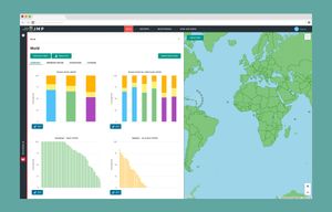
The JMP visual identity was also in need of a redesign so we created an identity which is based on their signature ladder charts. We produced a set of visual guidelines to help ensure consistency across both online and print.
The data
The interactive data tool allows users to explore, analyse, visualise and share JMP data. Starting from a world map view, visitors can access charts for drinking water, sanitation and hygiene by country of interest, SDG region or globally. Charts can be customised to analyse inequalities in service levels.
Users can create custom Ladder, Inequality, Rank and Trend charts for world, SDG region or country, additionally specifying periods of time, measure, types of chart, and inequality types. These custom charts can be titled, saved, shared online or downloaded as an image for use in a slideshow or report document.
Custom data tables can also be created by measure, inequality, ladder type, geography and time period, and can be downloaded as a csv file for analysis using other data software tools.
And to help users get the most out of the data visualisation features we created a series of five 7-10 minute screencasts.
Since the re-launch, site visits and sessions per year have both increased by more than 30%.